I go through color phases — pink when I was little, forest green throughout high school and college, and teal throughout my 20s. There was a dalliance with mint green (or sage, as Google calls it; it’s mint, okay?), but we don’t speak of that dark time. But once I bought the lavender Beats Fit Pro last year, I entered my purple era.
So you can see why I was stoked when Apple announced that the iPhone 14 Pro lineup would come in purple. Sorry, deep purple. My iPhone 12 Pro Max’s battery was on its last legs, and from the pictures, deep purple felt like an acceptable exchange for pacifica blue.
Friends, I’ve been bamboozled.
Is my iPhone 14 Pro Max technically purple? Maybe. If you hold it at the exact right angle in the right lighting. But 99.99 percent of the time, it just looks kind of… gray or even blue. Purple is the color of royalty and grandeur. My phone is grayish-blue cosplaying as purple. It’s the color of disappointment. If His Purple Majesty Prince were still with us today, I doubt this phone would pass muster.
/cdn.vox-cdn.com/uploads/chorus_asset/file/24020039/226270_iPHONE_14_PHO_akrales_0710.jpg)
Image: Amelia Holowaty Krales / The Verge
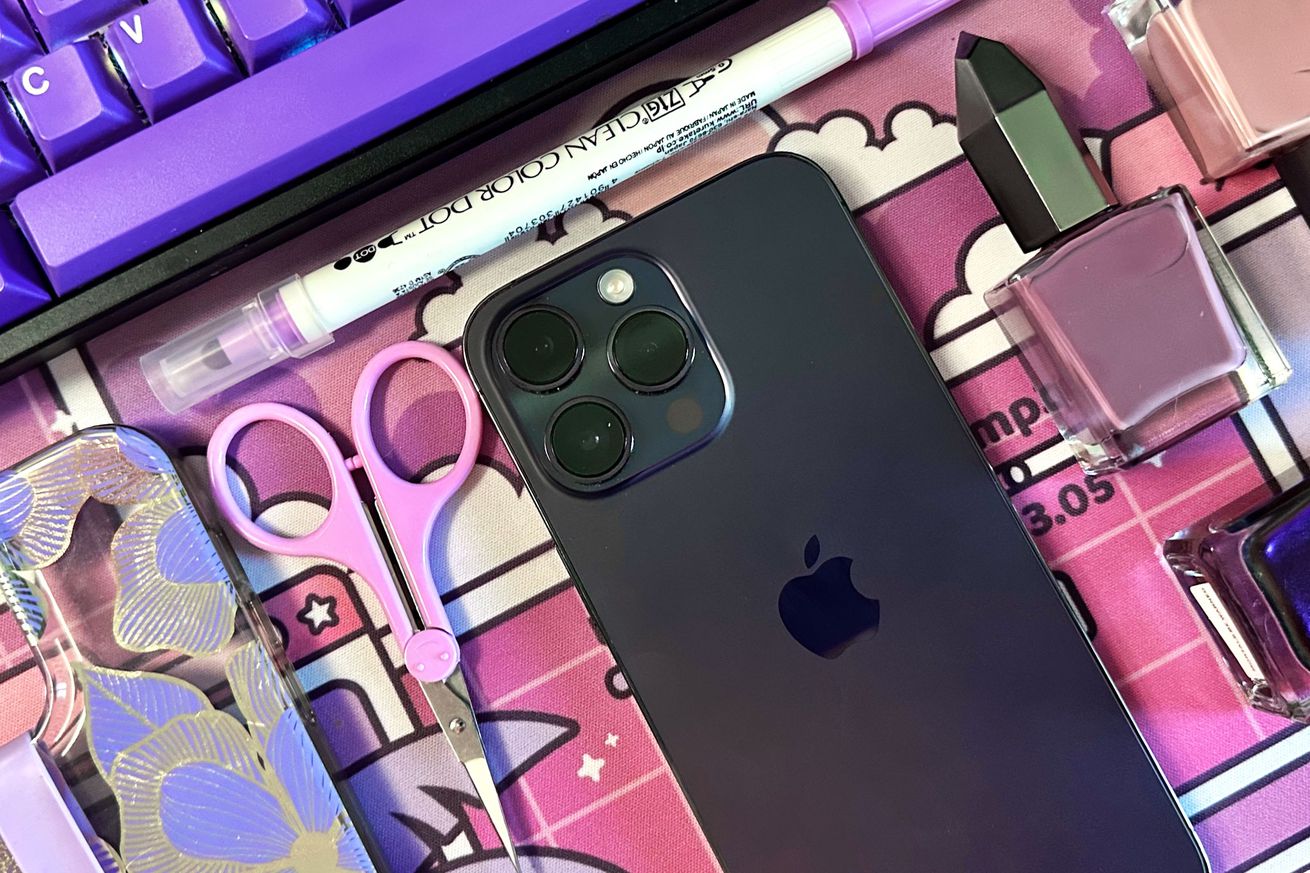
/cdn.vox-cdn.com/uploads/chorus_asset/file/24083306/DSC03728_processed.jpg)
Photo by Allison Johnson / The Verge
/cdn.vox-cdn.com/uploads/chorus_asset/file/22461377/vpavic_4547_20210421_0022.jpg)
Photo by Vjeran Pavic / The Verg
This iPhone 12 is actually purple. But the base model iPhone doesn’t have the features I need.
Normally, this kind of thing bothers me for 10 minutes and then I move on with my life. But over the past few months, I’ve been slowly switching over my desk mat, keycaps, backpack, luggage, nail polish, several shirts, notebooks, and other items to fit my new retro anime / vaporwave aesthetic. During this time, looking at my not-purple-enough phone makes my eye twitch. It wasn’t until I chatted with some fellow reviewers that I realized why.
I bought a Pro Max because it’s useful for my job. The camera is good enough that I can leave my ancient Canon at home when I go cover events, I don’t have to worry about grainy videos, I have the option of ProRAW for editing, and theoretically, the battery can last me a good long time on busy days. But would I have preferred the 14 Pro Max in the purple used for the base iPhone 12 and iPhone 14? Abso-freaking-lutely. The problem is that Apple only puts color on its lower-end products. To get a rich, bright, saturated color, I’d have to pick a phone that doesn’t have all the features I want. It’s never fun putting functionality first, but I got this purple pretender of a phone, didn’t I?
Never has there been better product placement than Elle Woods’ orange MacBook in Legally Blonde. pic.twitter.com/lAtmBBWqi2
— Netflix Tudum (@NetflixTudum) March 10, 2019
It’s baffling. There was a time when Apple was associated with bright colors. To this day, the Bondi blue iMac G3 in my elementary school’s computer lab lives rent-free in my head. Those colorful iPod commercials? Seared into my brain. Also, the iconic Elle Woods in Legally Blonde? She had a dope orange MacBook that made me, a hardcore Windows devotee at the time, jealous. It also helped that this orange laptop was used to make Elle visually and narratively stand out from her boring black laptop-carrying Harvard classmates.
That brings me back to my original point: Elle may not have looked like the stereotypical image of a lawyer, but her whimsical color choices didn’t make her any less of a professional. This divide between vivid colors and professionalism is a false dichotomy.
It’s not just phones, either. Would you like to buy the MacBook Pro in space gray or silver? Trick question. One is gray, and the other is darker gray — you buy whatever’s cheaper or available. Neither is nearly as fun as the gold MacBook Air, but if you need the Pro’s beefier computing power? Womp womp. How about the iPad Pro? This also is limited to space gray and silver. You’ll have to get the 10th-gen iPad, fifth-gen Air, or a Mini if you want to feel any sort of joie de vivre when looking at your gadget. It’s the same story for the green Apple Watch Series 7. It looks quite verdant in our review photos, but the strap is doing the heavy lifting. I wore the dang thing for a whole year. It’s black in the same way my phone is gray. At least with the Apple Watch, you can spring for fun straps.
/cdn.vox-cdn.com/uploads/chorus_asset/file/22521209/bfarsace_20210514_4583_0013.jpg)
Photo by Becca Farsace / The Verge
And it’s not like today’s Apple doesn’t know how to make vibrant, colorful products. When it launched the M1 iMacs, it did so with panache and pizzazz. Of the seven available colors, six are exactly the sort of color scheme I was hoping Apple would return to for its products. The other is silver and respectable, for places where joy isn’t allowed. If the purple one had a sliiiightly bigger screen (and more ports), I would buy it in a heartbeat. I’m pretty confident my serotonin levels would instantly quadruple.
I know this is small potatoes. Most people, myself included, put cases on their phones because we have the good sense to protect expensive purchases. Cases can have any number of colors, designs, and patterns. But we have to acknowledge that there are brave souls out here walking these streets caseless. They deserve a colorful phone with every feature under the sun if that’s what they want.
/cdn.vox-cdn.com/uploads/chorus_asset/file/22908913/vpavic_211006_4796_0110.jpg)
Photo by Vjeran Pavic / The Verge
/cdn.vox-cdn.com/uploads/chorus_asset/file/24089895/226330_Fitbit_Sense_2_VSong_0006.jpg)
Photo by Victoria Song / The Verge
As for me, I decided to channel my disappointment in this gray (I refuse to call it purple) iPhone into a creative challenge. It took a while, but I found a purple, gold, and clear case and slapped a lavender Sinjimoru phone strap onto it. My attempts to purple-fy my phone only increased its purple-osity by 2 percent, but I’ll take what I can get.
Apple isn’t the only company guilty of this. I got a bone to pick with Google and Samsung, too. The Pixel 7 gets the funky lemongrass colorway, while the 7 Pro has a muted hazel-bronze thing going on. It’s fine, but only because I may fall into a 1,000-year slumber if I see another black or white phone. I love the coral Pixel 7A, but again — why is vibrancy reserved for entry-level or midrange devices? Do you know how stoked I was to see that the Galaxy Watch 5 has a silver-purple colorway, only to visibly wilt when I realized the Watch 5 Pro — which I prefer functionally — only comes in black and gray?
Photo by Amelia Holowaty Krales / The Verge
/cdn.vox-cdn.com/uploads/chorus_asset/file/24643387/DSC04630_processed.jpg)
Photo by Allison Johnson / The Verge
For the record, I don’t think every gadget has to be an eye-searing neon. Black, white, and silver are versatile colors in their own right. And for certain professions, dark or muted palettes make sense. I probably wouldn’t take a lawyer clad in hot pink seriously in the courtroom — Elle Woods and Saul Goodman are both fictional lawyers, after all. But there are other professions where bright colors can convey professionalism and creativity. Fashion, design, art, or anything visually oriented, really. And in some professions, like mine, you can be a shriveled keyboard goblin in a rainbow onesie and still be a pro.
All I’m saying is I googled “purple” and found a list of 140 shades of purple with cool names like heliotrope, dark byzantium, and insolent purple. I’d like to note that this list includes deep purple, to which I have compared my phone under various lighting conditions. My phone is not deep purple. Anywho, if there happens to be a designer for a Big Tech firm reading this, when you’re pondering which colors to pick for 2024 or 2025, I’d like to humbly nominate these purples for consideration.
/cdn.vox-cdn.com/uploads/chorus_asset/file/24668509/Good_Purps.png)
Image: Coolors.co