07.04.2025
Apple's new Liquid Glass design is noticeable on the Home Screen right when you unlock your iPhone, though the degree of change is customizable. We've rounded up everything that's changed
Liquid Glass Design
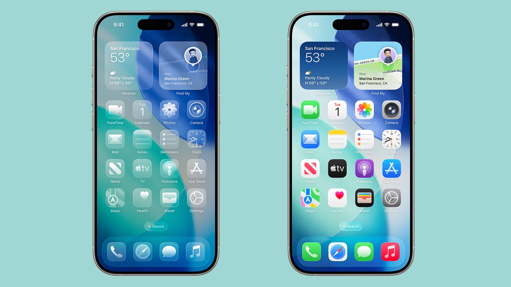
By default, app icons have a layered look with subtle depth, essentially appearing as multiple sheets of glass stacked on one another to create a glass-like translucent look.
Apple created Liquid Glass app icons for apps like Safari, Maps, Photos, the App Store, Mail and more. Third-party app icons are adopting the same aesthetic, and for apps with a simple design on a solid background, no update is needed. Icons like this already have a Liquid Glass look.
The dock is transparent and blends into the background behind it, and the same goes for the search button. App folders have a frosted glass design that also changes tint based on your wallpaper. When you edit your Home Screen, the buttons that you interact with are also transparent.
Interface elements like the dock, folders, and the search button have a lighting effect that changes when you move your iPhone, making them look like real glass.
Light, Dark and Tinted Modes
The Liquid Glass effect is apparent in both Light Mode and Dark Mode, with icons continuing to feature the same stacked glass look, just with a lighter or darker background.
Apple technically changed Light Mode to "Default Mode" in the customization settings where you can adjust color (long press on the display and tap on customize).
There are new "Always" and "Auto" toggles for enabling permanent Light or Dark styles or adjusting them based on time, and the Small and Large buttons for changing icon size have been relocated to the upper right of the customization interface.
Tinted mode looks different in iOS 26 than it did in iOS 18. Rather than icons featuring a black background with colored graphics, icons adopt the full color that you select with white graphics in Light Mode. In Dark Mode, backgrounds are a much darker shade of the color you choose, but aren't entirely black.
With Tinted icons, the layered glass look isn't as obvious, but it's still present.
Clear Icons
Apple added a "Clear" icon option in iOS 26 that's available alongside Default, Dark, and Tinted. As the name suggests, Clear has a dramatic Liquid Glass look with icons that are entirely transparent. The icons adopt the color of your wallpaper, with white text and designs.
There are Light and Dark options for the Clear setting. Light looks like frosted glass, while Dark looks like tinted glass. If you want to go all-in on Liquid Glass and have your iPhone look notably different, Clear is the option to choose.
Widgets
Widgets have some of the same aesthetic as icons, but on the whole, they don't look too much different from how they looked in iOS 18 in the Default mode.
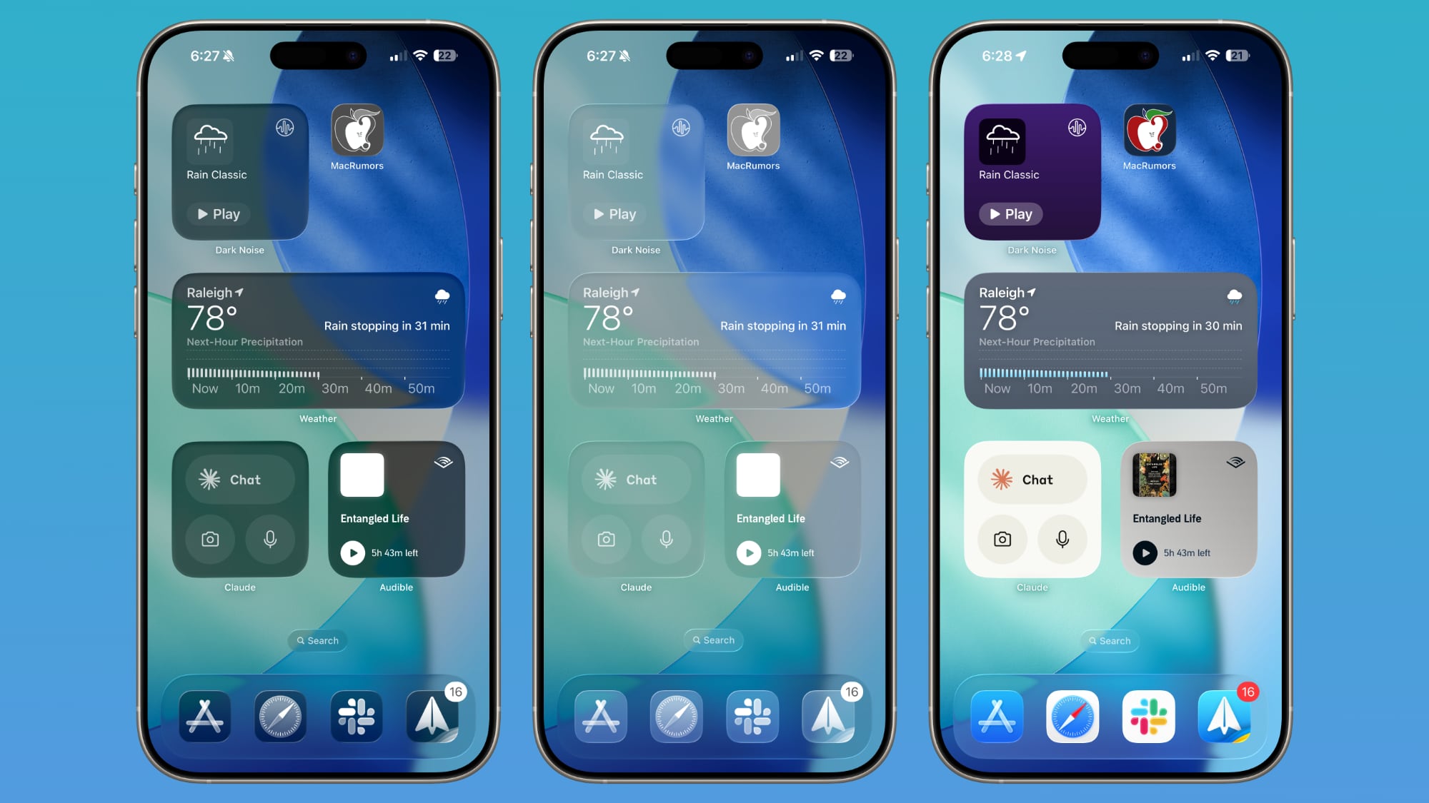
With the Clear option turned on, widgets are transparent and have a more cohesive design that matches with your wallpaper.
Wallpaper
You can edit your wallpaper directly from the Home Screen in iOS 26. Long press on the display and then tap on the new "Edit Wallpaper" option.
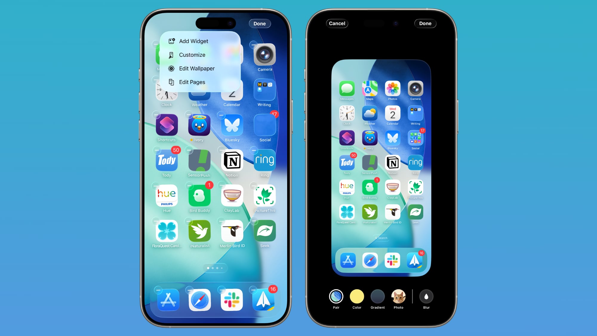
The wallpaper interface lets you change the image that you're using on the Home Screen, but it doesn't affect the Lock Screen. If you have a photo set as a wallpaper, for example, you can change the color, select a gradient, or choose a photo, plus you can turn blurring for images off or on.
Wallpaper takes a starring role in iOS 26 because it affects the color of the dock, folders, and icons, depending on your settings.
Control Center
Control Center adopts Liquid Glass, so while the functionality is the same, the general look is different. Compared to the iOS 18 Control Center, the iOS 26 version has depth for the icons with the Liquid Glass shifting light effect.
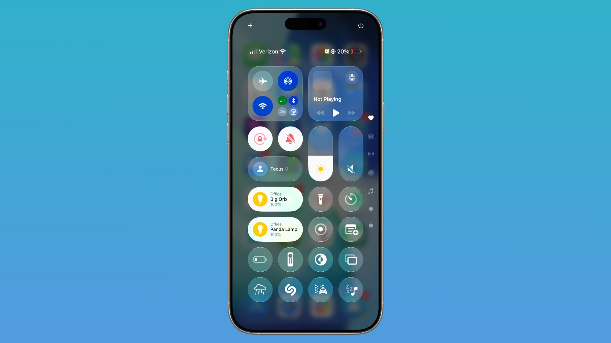
The icons are tinted to look like frosted glass, and some of the underlying buttons for adjusting Control Center have been tweaked with the updated look. Icons are a little larger, and some of the bar-shaped icons for volume, brightness, and other settings are rounder.
Other Home Screen Elements
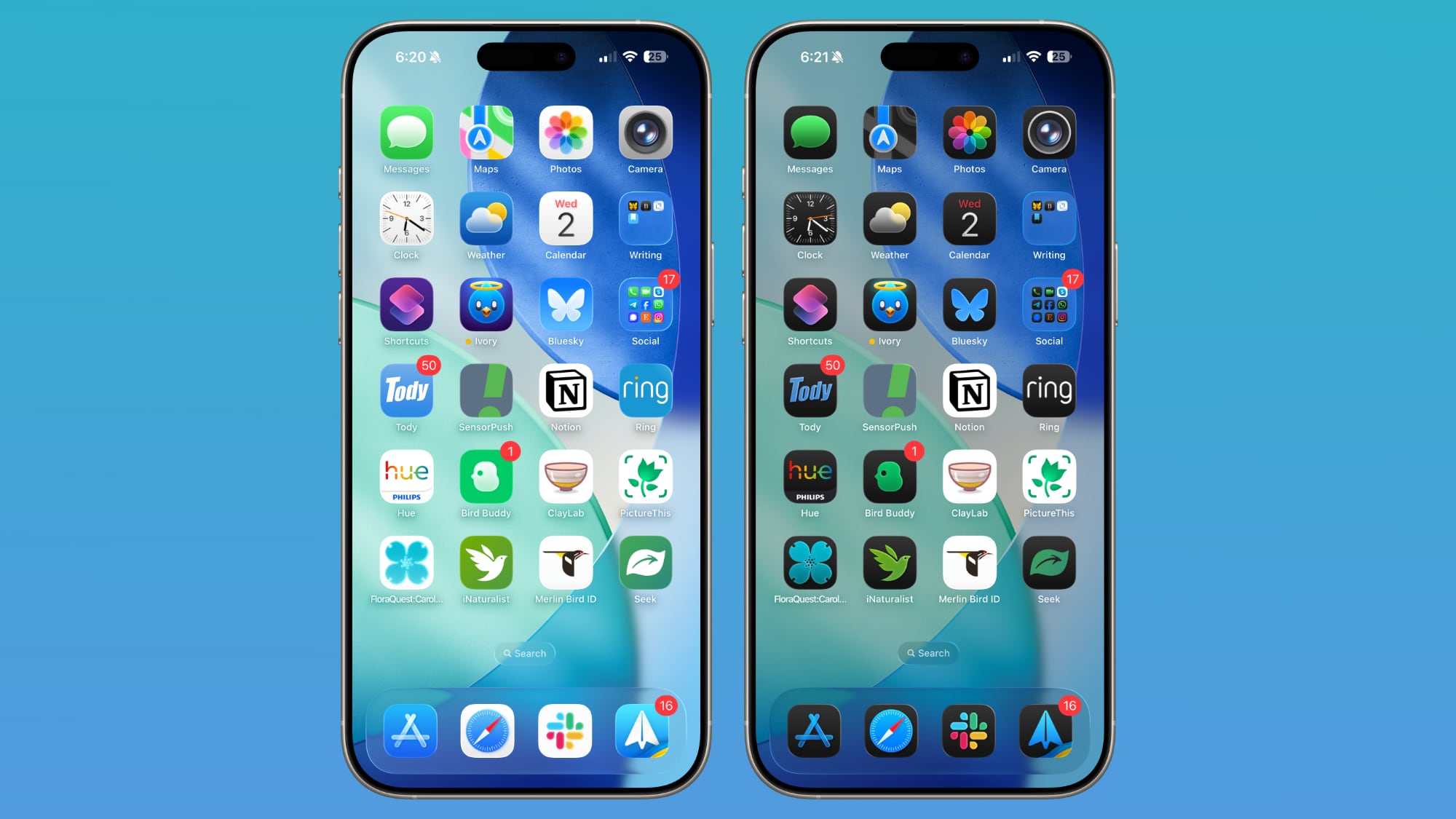
The Dynamic Island, Notification Center, long press gestures, and App Library have not changed beyond aesthetics. App Library folders are translucent and the search bar is rounded, and for widgets, there is a glass look of varying intensity depending on your icon color choice.
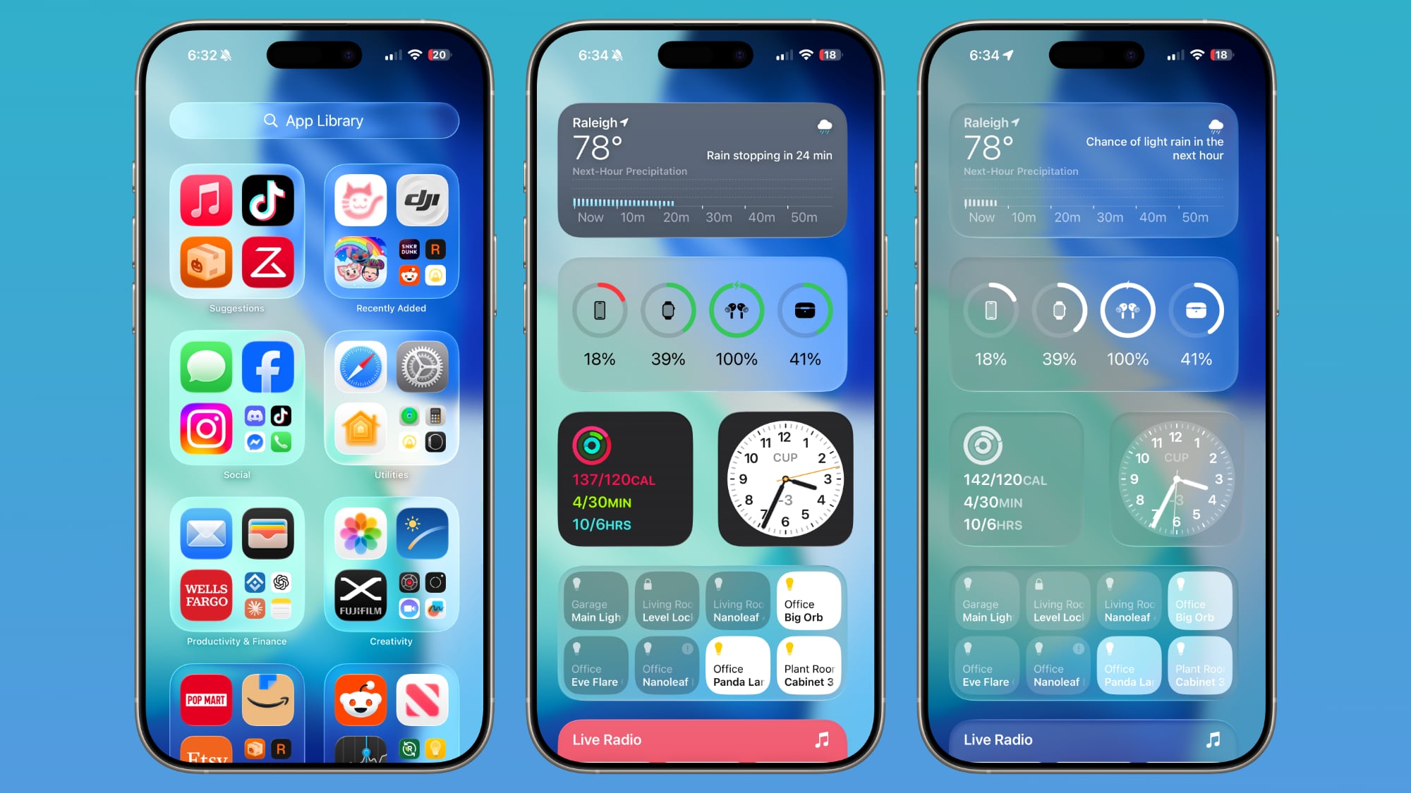
App Library icons are also slightly larger, with less padding between them.
Web Apps
When you add a website to your Home Screen in iOS 26, it always opens as a web app. Web apps were available on the Home Screen in iOS 18, but web developers needed to configure them to operate as web apps.
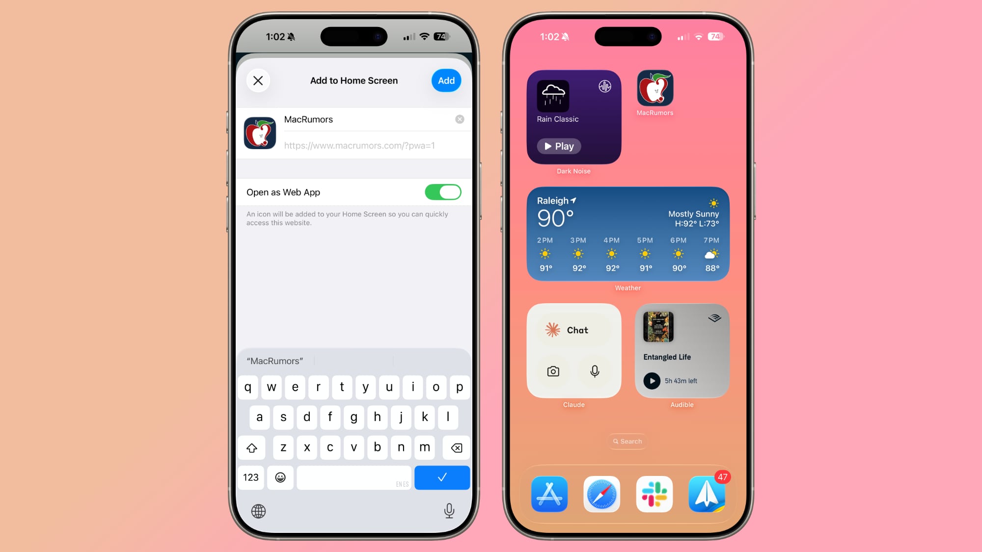
If websites weren't configured properly, they would open in Safari when added to the Home Screen. Now a website will open as a dedicated web app, even if it hasn't been explicitly set up to work that way.
There is an Open as Web App option that can be toggled off when adding a website to a Home Screen if you prefer that websites open up in Safari.
Read More
We have a dedicated iOS 26 roundup that goes into detail on all of the new features that are available in the update.
Related Forum: iOS 26
This article, "iOS 26: What's Changed With the iPhone's Home Screen" first appeared on MacRumors.com
Discuss this article in our forums
You may also be interested in this
Epic Games Lays Off Over …
09.28.2023
Epic Games, the company behind popular video game Fortnite, is laying off 830 employees or approximately 16 percent of its workforce. The layoffs come amid Epic's ongoing legal battle with
Apple Announces 2023 App …
11.30.2023
Apple today chose its 2023 App Store Award winners, highlighting the best apps and games on the iPhone, iPad, Mac, and more. Apple is recognizing 14 apps and games in
Apple Announces iOS 18 Ac…
05.15.2024
Apple today previewed several new accessibility features coming later this year with software updates like iOS 18, iPadOS 18, macOS 15, and visionOS 2. The announcement comes one day ahead
Apple iPhone’s market sha…
05.22.2023
Colombia’s Q1 2023 smartphone shipments fell 9% YoY, but Apple’s iPhone showed remarkable resiliency with a 60% YoY increase in shipment volume, doubling iPhone’s share of the country’s smartphone market
2024 iPad Pro: Key Rumors…
03.12.2024
Apple's next-generation iPad Pro models are expected to be announced in a matter of weeks, so what can customers expect from the highly anticipated new machines? The 2022 iPad Pro
Apple Explains Why iPhone…
09.20.2023
In an interview with Numerama's Nicolas Lellouche, Apple's VP of camera software engineering Jon McCormack explained why the iPhone 15 Pro Max's tetraprism lens system is limited to 5x optical
Gurman: Redesigned Magic …
08.27.2023
Apple's next-generation iPad Pro will launch alongside a redesigned Magic Keyboard accessory that makes the device more laptop-like, according to Bloomberg's Mark Gurman. In the latest edition of his "Power
Top Stories: New Apple Wa…
08.05.2023
We're just about a month away from the introduction of the iPhone 15 lineup, but it's far from the only product in Apple's pipeline as this week saw fresh rumors