07.09.2025
Apple has been refining Liquid Glass during the developer beta testing process, and both beta two and beta three have introduced some major tweaks. There was little outcry over the
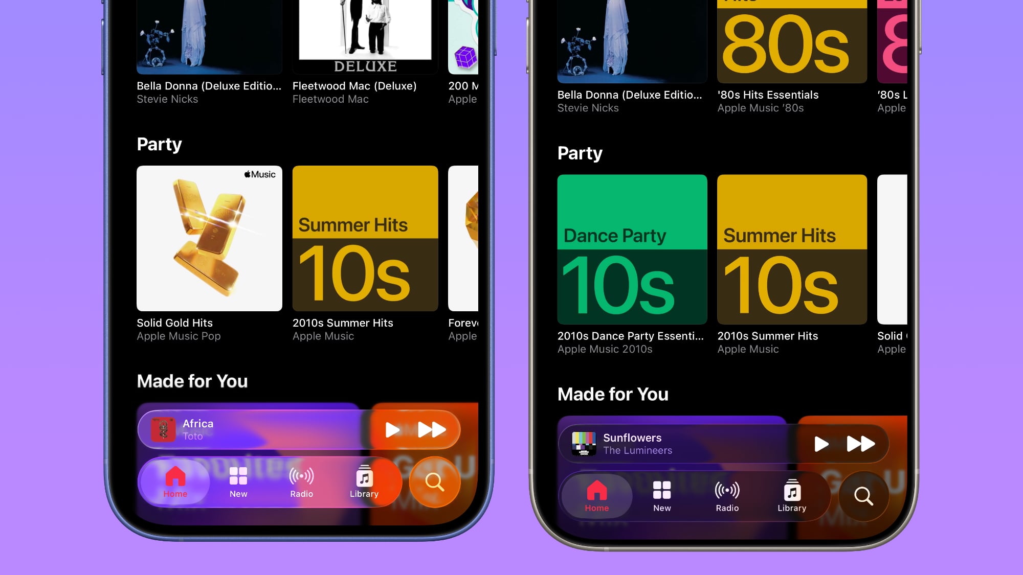
For context, Apple made navigation bars more opaque across many apps in iOS 26 beta 3, and we've got a series of side-by-side comparisons that demonstrate what's different. In all of the comparison images, beta 2 is on the left and beta 3 is on the right.
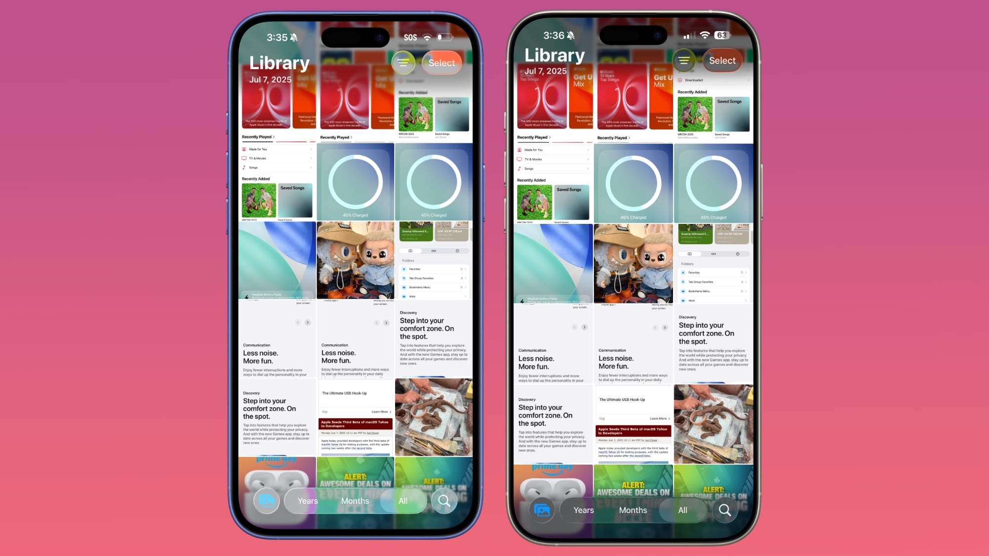
Apple Music
Apple Music's bottom navigation bar is more opaque, and it has the frosted glass look that Apple is now favoring. The change is most noticeable when scrolling over a background that has color. In beta 2, the navigation bar was almost translucent, allowing much of the background color to shine through. That effect is significantly reduced in beta 3.
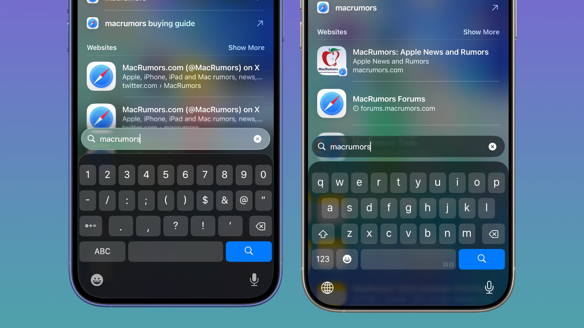
Safari
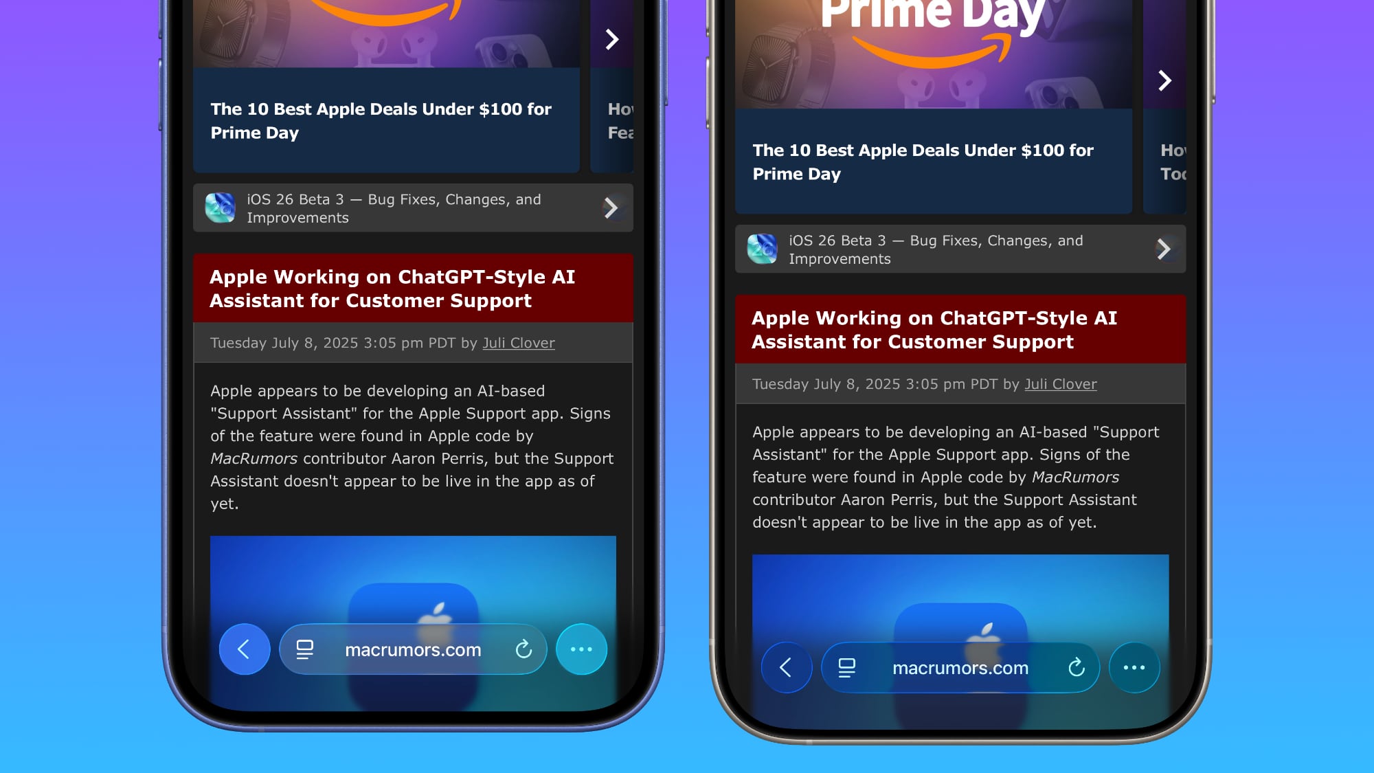
The changes in Safari vary depending on what you're doing, the background color of the website, and which Tab View design you're using. In general, the URL bar is more opaque and less prone to notable shifts in color. Less of the background comes through.
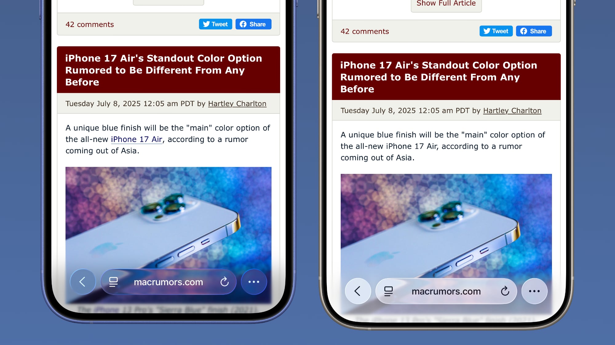
The URL bar will still change from light to dark if the content you're scrolling over is predominantly dark, but there's a higher threshold for that to kick on.
It's easiest to see the difference with the Compact View, because it was the most translucent view to begin with.
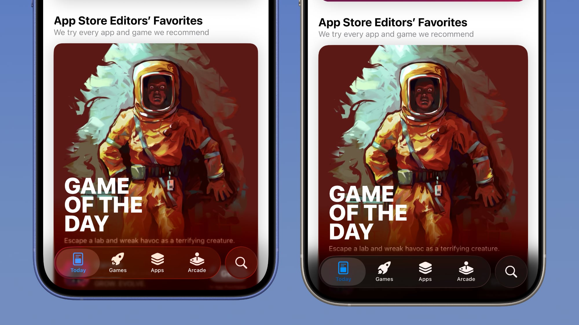
App Store
The App Store's navigation bar has one of the most noticeable changes, and it's almost entirely opaque now.
Light Mode
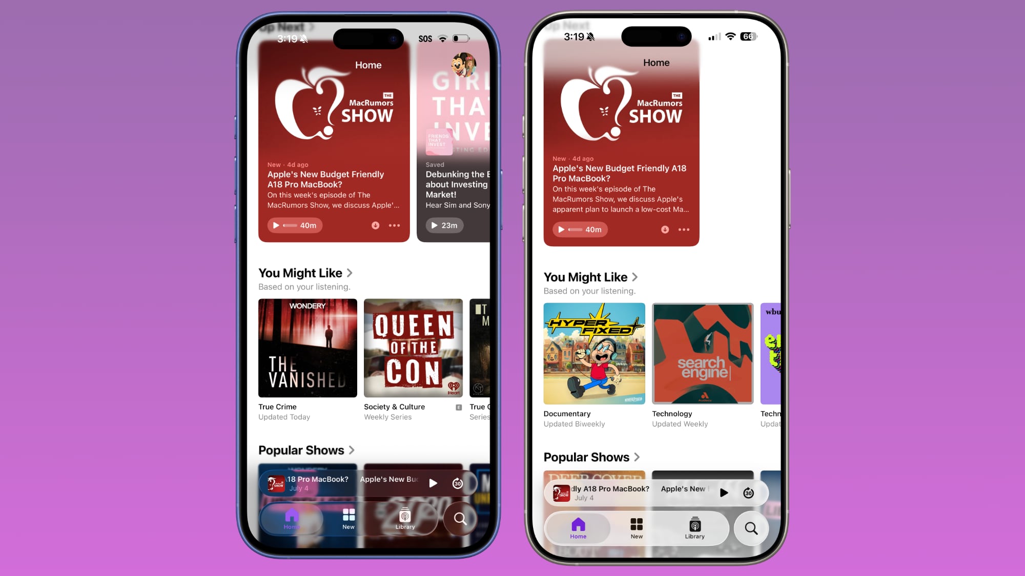
Podcasts
As with Apple Music, translucency has been almost entirely eliminated in the Podcasts navigation bar. The change is easiest to see with backgrounds that have color.
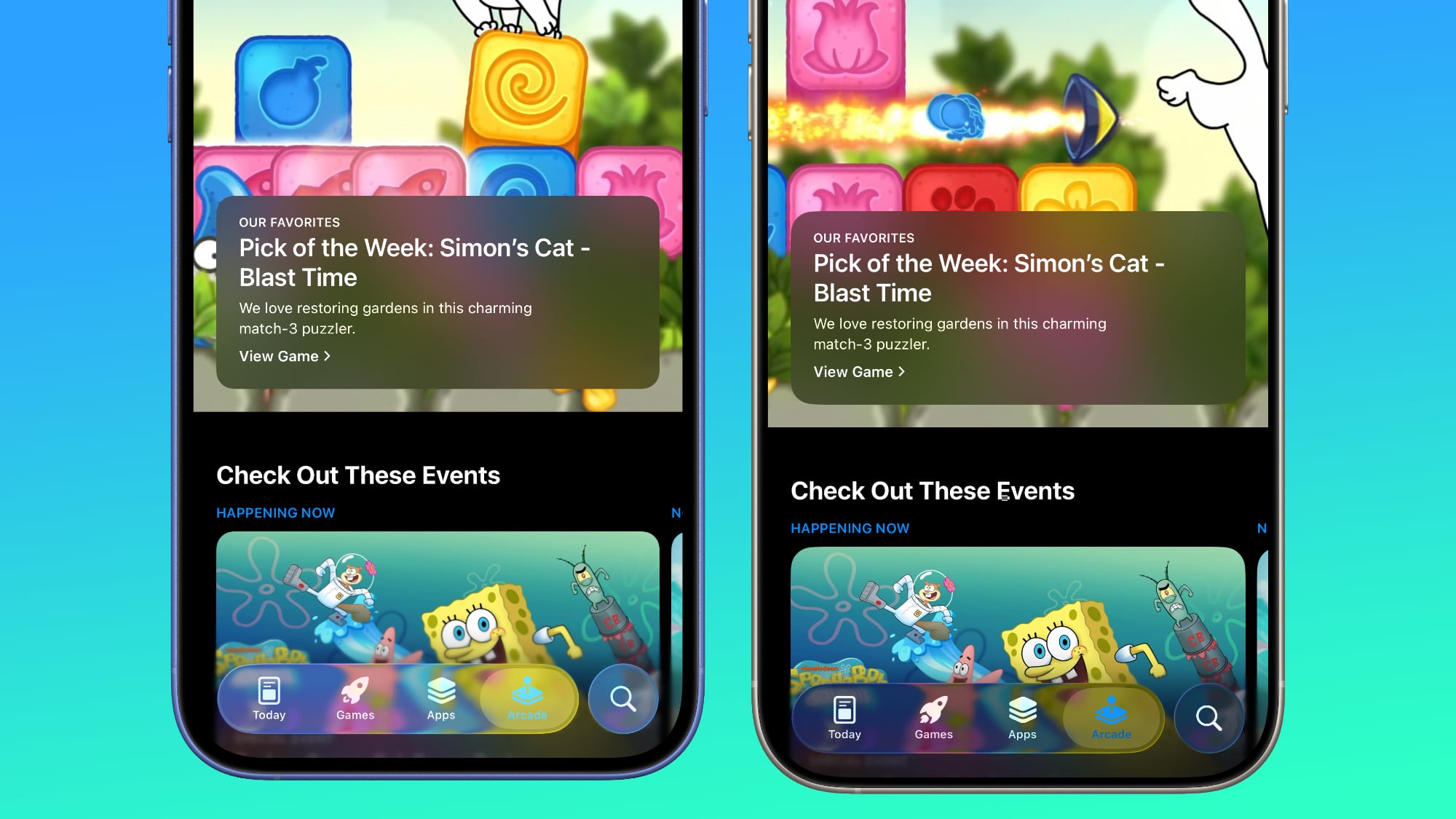
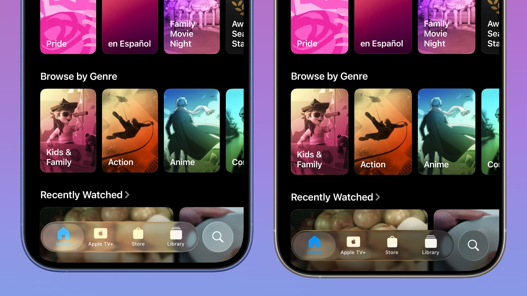
Apple TV
The Apple TV app has a darker background and the change is more subtle. The overlaying navigation bar is a darker glass color, but transparency appears to be similar.
Photos
For the Photos app, Apple tweaked the design in a similar way to the Apple TV app. The navigation bar is darker, but there's been little change to transparency.
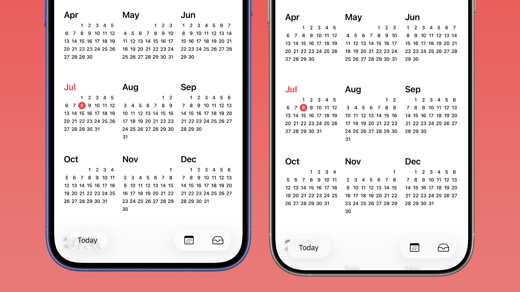
Calendar
Calendar's navigation buttons are more opaque, both in Light Mode and Dark Mode.
Keyboard
The Spotlight Search keyboard is both more and less translucent. The keyboard itself has slightly more background visible, but the search bar is darker.
Dark Mode
Dark Mode has retained more transparency than Light Mode for the most part, so you may see less of a difference if you have Dark Mode enabled permanently. Some menu bar elements are darker than before, but white text on a dark background is more readable so Apple had to increase the opaqueness less.
This isn't true for all apps, though, and there are areas with dark navigation bars that also have less translucency.
Color Dependency
The difference that you see between beta 2 and beta 3 can vary quite a bit depending on the color in the background. With some white backgrounds, it's hard to tell that the Liquid Glass has a more frosted appearance, and the updates are mostly noticeable with light colors.
Over content that is are darker, navigation bars will often transition to their Dark Mode view that appears more translucent, as can be seen in the Safari screenshot below. This is the same effect you'll see with Dark Mode enabled.
Notifications, Lock Screen, and Home Screen
On the Lock Screen, the time is ever so slightly more opaque than it was before. With some background colors, notifications also have a darker background than before, but this isn't always noticeable. Home Screen and Control Center haven't changed much if at all.
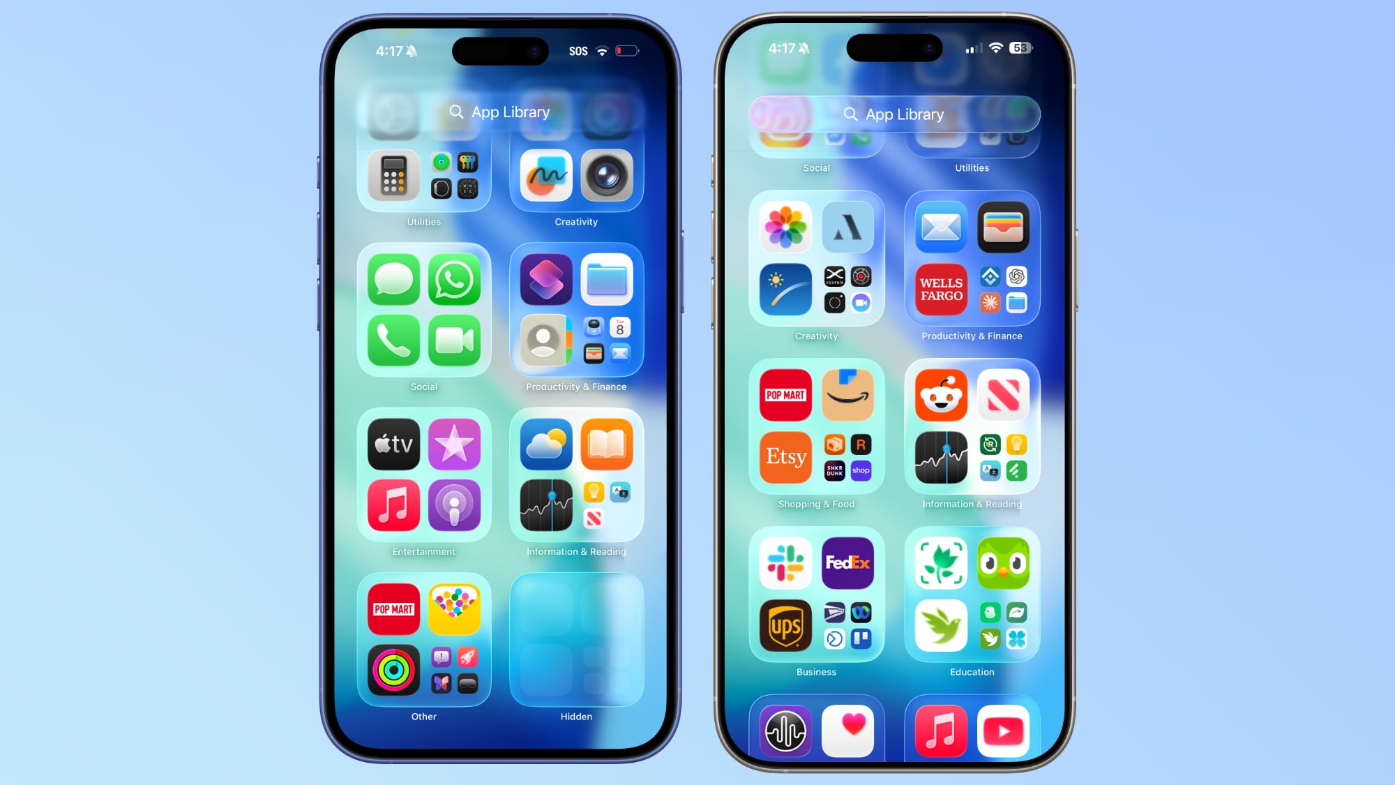
For App Library, the search bar doesn't have blurred edges when scrolling, which makes it easier to see. Apple hasn't changed translucency.
Other App Changes
Most of Apple's built-in apps have tweaked buttons and navigation bars in iOS 26 beta 3, with repeats of the design changes listed above.
- Weather - The buttons at the bottom of the app are much darker than before, and the search button is no longer translucent.
- Camera - No noticeable change.
- FaceTime - No noticeable change.
- Messages - The search bar isn't as translucent, nor is the message compose bar. Popover buttons haven't changed.
- Maps - Maps is actually more translucent, because it's using Liquid Glass for the turn-by-turn directions that are shown at the top of the app.
- Mail - Buttons have less translucency.
- Notes - The buttons and navigation bar in the Notes app already had little translucency, but it's been reduced further and is almost non-existent.
- Reminders - When you're composing a Reminder, the toolbar has less translucency. The search bar and popover menus are the same.
- Clock - No change.
- Health - The Health app's navigation bar and search bar are a little less transparent, but it was already fairly opaque.
- Wallet - Buttons aren't as transparent, so if you scroll over something with bright colors, it's no longer visible behind the button.
- Settings - The Search bar is more opaque.
- Find My - No change.
- Stocks - The translucency of Top Stories is unchanged, but the search bar has increased opacity.
- Home - Less opacity overall for navigation bar and home control buttons.
- Books - Navigation menus and search have less translucency.
- Fitness - Little change because the app uses a darker background, but the buttons are a touch darker than before.
- Contacts - Less translucency for search.
- Files - Less translucency for navigation bar and search.
- Translate - No change.
- Shortcuts - Less translucency for navigation bar. Keyboard translucency remains the same.
- Calculator - History interface is more opaque.
- Voice Memos - No change.
- Compass - No change.
- Passwords - Navigation bar and search interface lost translucency.
- Games - Navigation bar is darker and less translucent.
- Preview - No change.
What do you think of the changes that Apple made in iOS 26 beta 3? Are you hoping for some of the Liquid Glass design to be reimplemented, or do you prefer the more opaque look? Let us know in the comments below.
Related Forum: iOS 26
This article, "iOS 26 Liquid Glass Design Drama: Beta 2 vs. Beta 3 Changes in Every App" first appeared on MacRumors.com
Discuss this article in our forums
You may also be interested in this
Tim Cook Teases an ‘…
02.13.2025
In a social media post today, Apple CEO Tim Cook teased an upcoming "launch" on Wednesday, February 19. No time was provided. "Get ready to meet the newest member of
AirPods 4 Hit $99.99 Low …
03.09.2025
Amazon this weekend has major discounts on a few AirPods models, including the return of the all-time low price on the AirPods 4. You can get the base AirPods 4
Apple’s EU App Stor…
01.26.2024
Apple announced an overwhelming number of changes to the app ecosystem in the European Union yesterday, and with the flood of information, there may have been a few details that
iPhone 16e vs. iPhone 16 …
02.19.2025
Apple's all-new iPhone 16e joins the lineup as a cheaper alternative to the iPhone 16. Despite sharing most of their features, there are still more than 25 differences between the
The MacRumors Show: 2024 …
12.22.2023
As 2023 begins to draw to a close, on this week's episode of The MacRumors Show we take your questions about Apple rumors and more. Subscribe to The MacRumors Show
Apple Opens Up NFC to Thi…
01.25.2024
As part of major changes being made to the app ecosystem in the EU in iOS 17.4, Apple is allowing apps to access and use the iPhone's NFC chip. Going
New iPhone 16 Pro 2TB Sto…
09.04.2024
As Apple's iPhone 16 launch approaches, questions are swirling about a potential leap in storage capacity for the iPhone 16 Pro models. According to a January report, the iPhone 16
Apple Store Goes Down Ahe…
09.12.2023
Apple's online store is now down ahead of the company's annual September event, which begins at 10 a.m. Pacific Time today. The store is routinely taken offline ahead of major