11.20.2025
Apple Watch owners have been voicing their frustration online over changes to the Workout app that Apple introduced in watchOS 26, with many finding the redesigned interface makes starting exercises
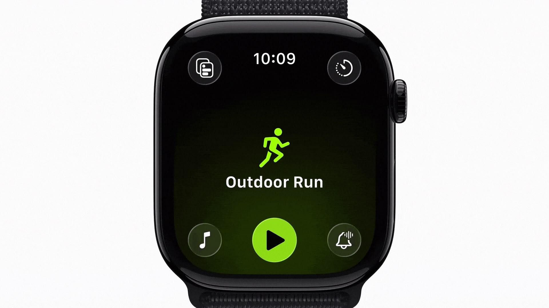
When Apple launched watchOS 26 in September, the Workout app went from large, easily tapped workout tiles to a scrolling, corner-button interface. Instead of tapping a workout once to begin, users now select the workout type, and then tap a smaller play button that appears after a brief animation. Apple has also integrated music and podcast setup directly into the Workout app itself, so users can configure audio to automatically begin playing when they start exercising.
However, many of the changes appear to have become a major source of frustration over the last couple of months, based on a Reddit thread on r/AppleWatch that's full of complaints. "Touch targets are way too small," one user wrote. "Often times I have to tap the play button several times to get the workout to start."
Another user said the update has been "absolutely horrible," adding that "activating a swimming workout has become impossible once in the pool." Several swimmers echoed this view. One notes that the latest design makes it "impossible to reliably start or switch workouts once you're wet or mid-lap."
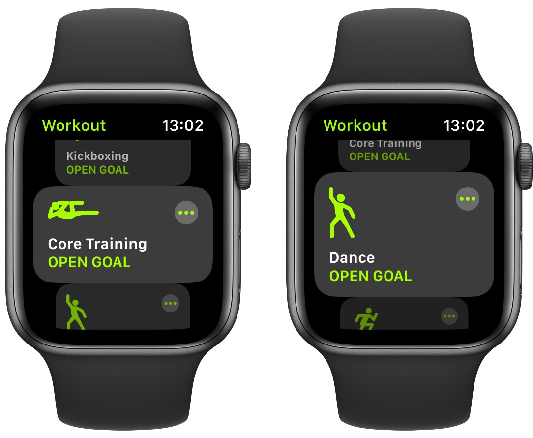
The redesigned layout also moves common controls like goal settings, quick-start options, and frequently used workouts into different positions. Long-time users say this breaks years of muscle memory. "What I used to be able to do in my sleep without thinking now takes my full brain capacity and always annoys me just before my workout," one user noted.
Some users also report reliability issues, like tapping the start button and seeing the press animation without the workout actually starting, or walking workouts failing to register completely. Mis-starts are another recurring issue. "I've accidentally started the wrong workout so many times," one user wrote. "The play button loads late, so I think I'm scrolling, but I actually tap it the moment it appears." Another said they've watched the button animate when tapped, "and then found out later that it didn't actually register."
The old Workout interface in watchOS 18
"The scrolling is so bad now," wrote another user, while others said the interface simply feels laggy. One explained that "the delay between selecting and starting is so long that I constantly overshoot or open the wrong thing."
Some users have turned to Siri voice commands to bypass the new interface altogether, while others rely on the Action button on Apple Watch Ultra models to start workouts directly. A few say they've been letting auto-detection handle walking and cycling sessions simply because it's less tedious than navigating the UI.
What have your experiences been with the Workout app on Apple Watch since the watchOS 26 update? Do you get on with the redesigned interface, or is it a step backwards from watchOS 18? Let us know in the comments.
This article, "Apple Watch Users Claim Workout App Is Now Worse in Every Way" first appeared on MacRumors.com
Discuss this article in our forums
You may also be interested in this
iPhone 17 may get cutting…
07.10.2024
Apple's chip-maker TSMC to trial 2nm processors ahead of schedule. The improved production process could be used for the iPhone 17's A19 chip. (via Cult of Mac - Apple news,
Apple releases Pages, Key…
04.02.2024
Apple on Tuesday updated its Work apps: Pages, Keynote, and Numbers for the Mac, iPad, and iPhone. Pages 14.0: • Press and hold the Command key to select noncontiguous words,
A long-time rumor about a…
12.03.2024
Macworld Apple is known for the excruciating detail it puts into the design and engineering of its products. But stuff happens every once in a while—for example when the Macintosh
Gene Munster highlights t…
10.31.2023
M3 Max MacBook Pro 16-inch in Space Black DeepWater Management’s Gene Munster said that the important takeaway from Apple’s “Scary Fast” event centers around the powerful new M3 chip lineup
Apple might add a smart d…
05.24.2023
Illustration by Nick Barclay / The Verge Apple is working on a new feature in iOS 17 that turns the iPhone’s screen into a smart home-style display, according to a
Get ready for one of Appl…
05.17.2023
At WWDC, Apple’s annual developer conference on June 5th, the company is expected to announce a new mixed-reality (AR+VR) headset which resembles a pair of ski goggles, comes with an
Timekettle Fluentalk T1 T…
05.19.2023
The Timekettle Fluentalk T1 Translator Device is a well-built language translator that allows you to convert foreign text by verbalizing or photographing it — but you own an alternative already.Timekettle
Best iPad for kids 2025: …
11.19.2025
Macworld Our kids love their iPads. The simplicity of tapping on the screen when they want things to happen means they can learn to use them in seconds, but there’s