The biggest change is a slick new design for the Now Playing screen, which allows the dominant color of the podcast art – or any episode chapter images – to take over the entire screen, sometimes with additional patterning.

The playback controls on the bottom half of the screen have also been rejigged. The play speed button has been moved from the bottom left corner of the screen and now sits next to the rewind button.

Podcasts app in iOS 16 (left) versus iOS 17

The sleep timer button has also been moved from the bottom right corner and is now located next to the fast-forward button, so the main bank of controls is more compact with five buttons in the row instead of just rewind, play, and fast-forward. Some buttons also now take on a neat new glow when activated.

The queue interface has changed, too. Whereas previously you swiped up to see if anything was in the Playing Next list, now there's a dedicated queue button at the bottom next to the AirPlay icon.

Podcasts app in iOS 16 (left) versus iOS 17

Pressing it brings up a whole new screen showing any queued episodes as a list. You can swipe to remove an episode from the queue or clear the list, and if there are no episodes up next it will tell you that nothing is queued.

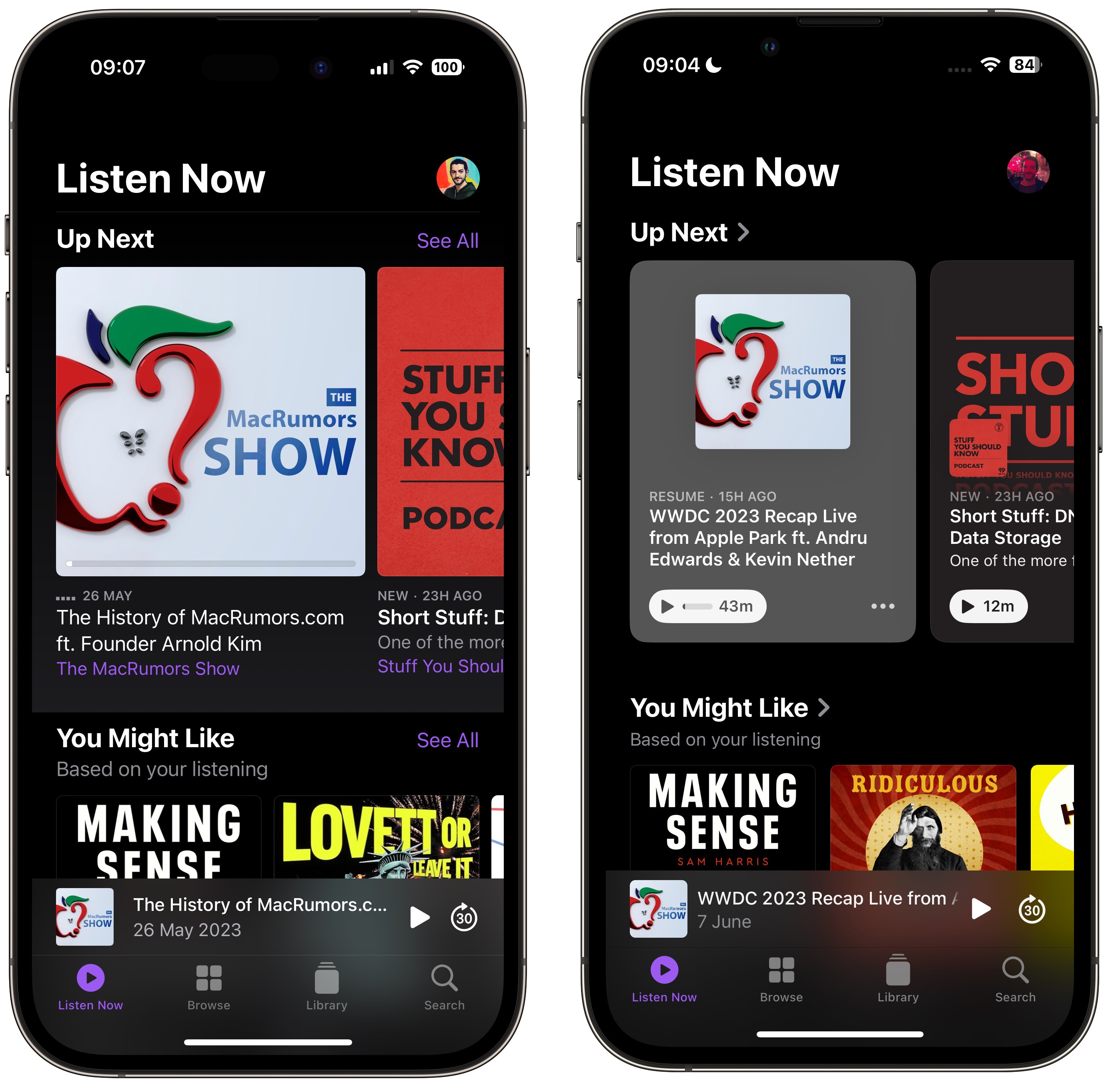
The Up Next carousel at the top of the Listen Now screen features redesigned cards that add a color shade to go with the podcast's art, and they feature a new three-dot options menu icon, a new compact playback indicator that shows if you have started a podcast but not finished it, as well as the episode's length.

Podcasts app in iOS 16 (left) versus iOS 17

The same indicator can also be found in the Up Next screen, where the "Play Next" and "Play Last" options have been replaced with "Add to Queue."

Podcasts app in iOS 16 (left) versus iOS 17

In iOS 16, if you've completed an episode in a podcast's episodes list, it just says Played below the episode summary. In iOS 17, that's been replaced by a replay icon and the episode length. A checkmark now also sits next to the date above the episode title, indicating that you've listened to it.
Related Roundup: iOS 17
Tag: Apple Podcasts

This article, "Here's What's New in the iOS 17 Podcasts App" first appeared on MacRumors.com

Discuss this article in our forums

The biggest change is a slick new design for the Now Playing screen, which allows the dominant color of the podcast art – or any episode chapter images – to take over the entire screen, sometimes with additional patterning.

The playback controls on the bottom half of the screen have also been rejigged. The play speed button has been moved from the bottom left corner of the screen and now sits next to the rewind button.

Podcasts app in iOS 16 (left) versus iOS 17

The sleep timer button has also been moved from the bottom right corner and is now located next to the fast-forward button, so the main bank of controls is more compact with five buttons in the row instead of just rewind, play, and fast-forward. Some buttons also now take on a neat new glow when activated.

The queue interface has changed, too. Whereas previously you swiped up to see if anything was in the Playing Next list, now there's a dedicated queue button at the bottom next to the AirPlay icon.

Podcasts app in iOS 16 (left) versus iOS 17

Pressing it brings up a whole new screen showing any queued episodes as a list. You can swipe to remove an episode from the queue or clear the list, and if there are no episodes up next it will tell you that nothing is queued.

The Up Next carousel at the top of the Listen Now screen features redesigned cards that add a color shade to go with the podcast's art, and they feature a new three-dot options menu icon, a new compact playback indicator that shows if you have started a podcast but not finished it, as well as the episode's length.

Podcasts app in iOS 16 (left) versus iOS 17

The same indicator can also be found in the Up Next screen, where the "Play Next" and "Play Last" options have been replaced with "Add to Queue."

Podcasts app in iOS 16 (left) versus iOS 17

In iOS 16, if you've completed an episode in a podcast's episodes list, it just says Played below the episode summary. In iOS 17, that's been replaced by a replay icon and the episode length. A checkmark now also sits next to the date above the episode title, indicating that you've listened to it.
Related Roundup: iOS 17

This article, "Here's What's New in the iOS 17 Podcasts App" first appeared on MacRumors.com

Discuss this article in our forums
Apple in iOS 17 has revised several elements of its stock apps, including the Podcasts app. There are a few noteworthy changes to the functionality and design of the app
Apple in iOS 17 has revised several elements of its stock apps, including the Podcasts app. There are a few noteworthy changes to the functionality and design of the app with the update, as detailed below.
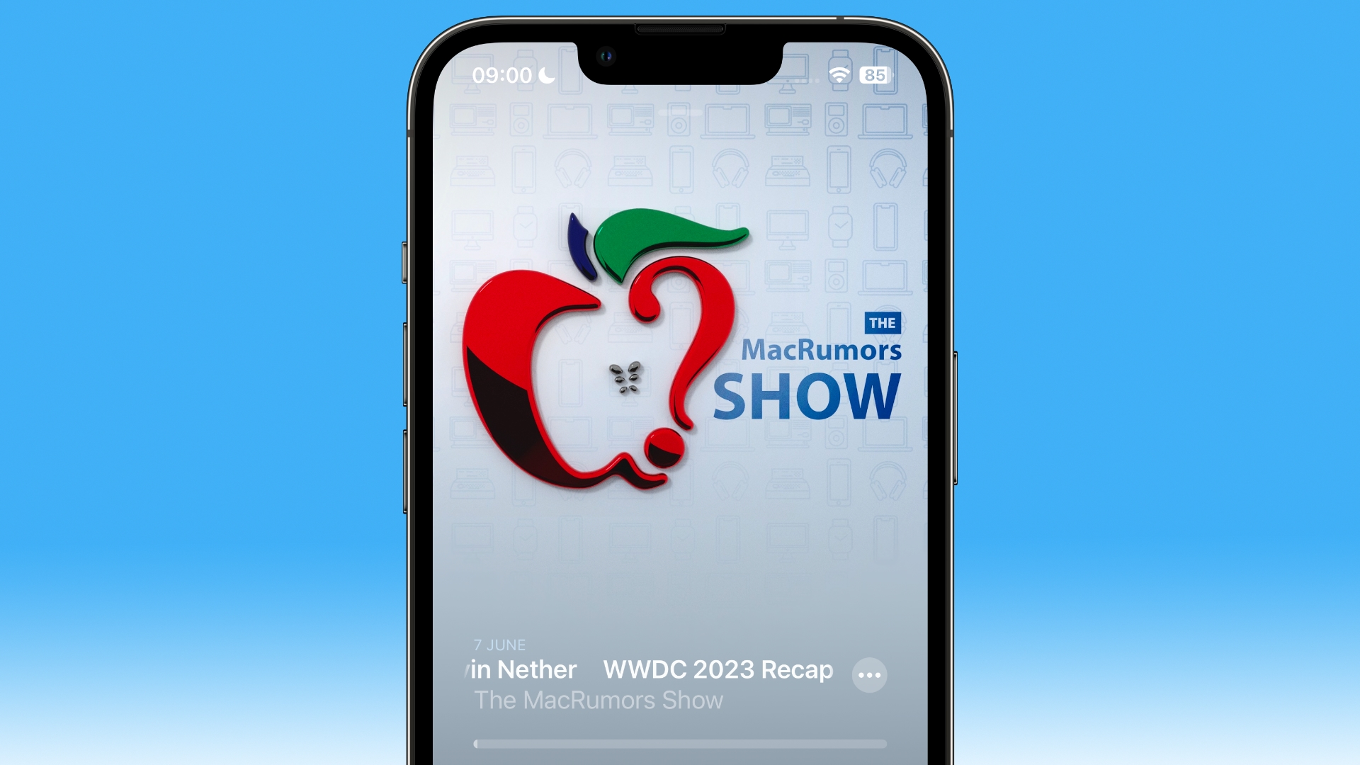

The biggest change is a slick new design for the Now Playing screen, which allows the dominant color of the podcast art – or any episode chapter images – to take over the entire screen, sometimes with additional patterning.

The playback controls on the bottom half of the screen have also been rejigged. The play speed button has been moved from the bottom left corner of the screen and now sits next to the rewind button.
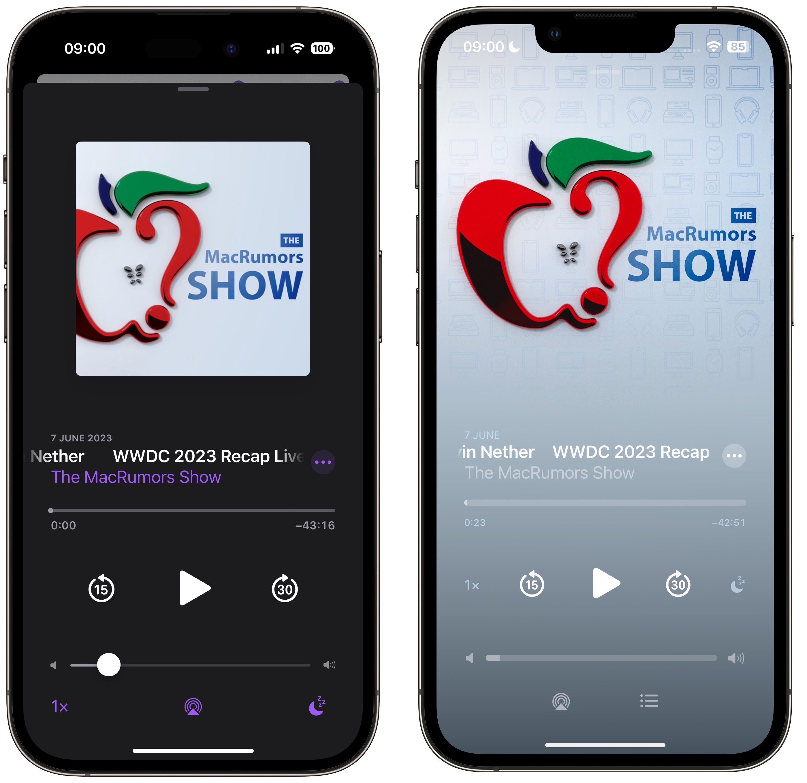
Podcasts app in iOS 16 (left) versus iOS 17

The sleep timer button has also been moved from the bottom right corner and is now located next to the fast-forward button, so the main bank of controls is more compact with five buttons in the row instead of just rewind, play, and fast-forward. Some buttons also now take on a neat new glow when activated.

The queue interface has changed, too. Whereas previously you swiped up to see if anything was in the Playing Next list, now there's a dedicated queue button at the bottom next to the AirPlay icon.
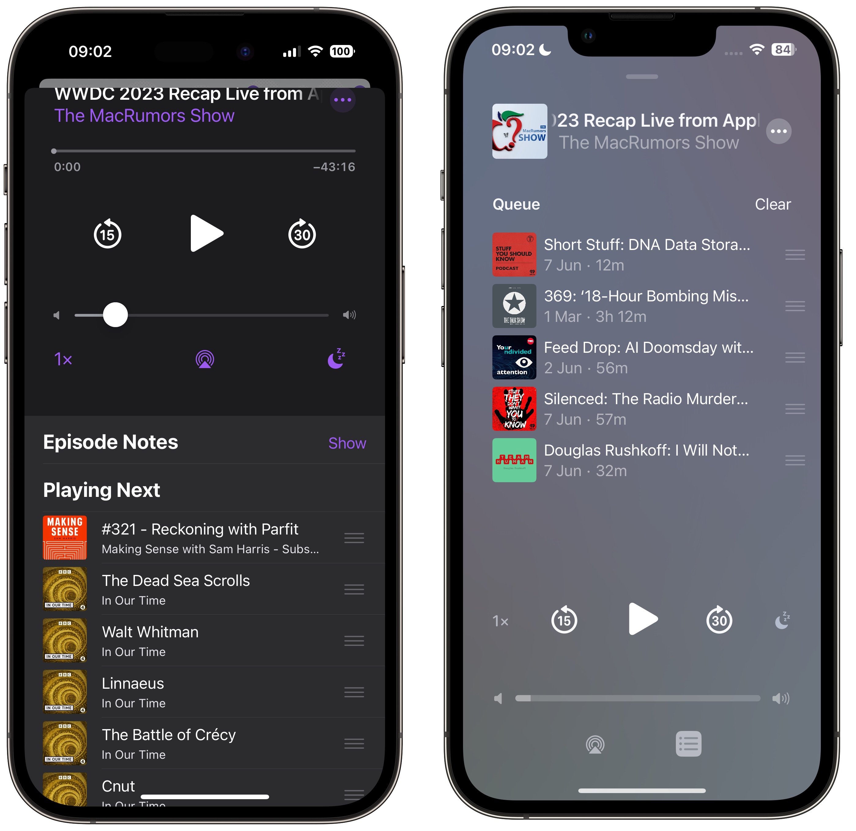
Podcasts app in iOS 16 (left) versus iOS 17

Pressing it brings up a whole new screen showing any queued episodes as a list. You can swipe to remove an episode from the queue or clear the list, and if there are no episodes up next it will tell you that nothing is queued.

The Up Next carousel at the top of the Listen Now screen features redesigned cards that add a color shade to go with the podcast's art, and they feature a new three-dot options menu icon, a new compact playback indicator that shows if you have started a podcast but not finished it, as well as the episode's length.

Podcasts app in iOS 16 (left) versus iOS 17

The same indicator can also be found in the Up Next screen, where the "Play Next" and "Play Last" options have been replaced with "Add to Queue."

Podcasts app in iOS 16 (left) versus iOS 17

In iOS 16, if you've completed an episode in a podcast's episodes list, it just says Played below the episode summary. In iOS 17, that's been replaced by a replay icon and the episode length. A checkmark now also sits next to the date above the episode title, indicating that you've listened to it.
Related Roundup: iOS 17

This article, "Here's What's New in the iOS 17 Podcasts App" first appeared on MacRumors.com

Discuss this article in our forums

original link


You may also be interested in this

Inside Apple Tysons Corne…

Tysons Corner was the location of the very first Apple Store to open, and on its 22-year anniversary it opens again in a larger venue. Here's what it looks like

MacBook Air 2024: A Revol…

Apple's iconic MacBook Air has captivated users for over a decade with its sleek design, portability, and impressive performance. The 2024 iteration promises to revolutionize the laptop experience once again,

Apple announces new Music…

Following the launch of Apple's next operating systems for its devices, the company has now revealed new features and improvements coming to almost all of its services.New features are coming

14-inch M2 Pro MacBook Pr…

All of Wednesday’s best deals are now live to celebrate the halfway point in the work week. On tap today we have some notable deals from the Apple world, including

Three app creators shapin…

The creators behind Boddle, Run Legends, and Wysa share how they’re empowering people with their cutting-edge apps.

Steam update brings new f…

Steam has rolled out a notable app update featuring a revamped in-game overlay, fresh note capabilities, and the ability to pin in-game windows.Valve updates the Steam appValve first announced it

No matter how great Apple…

Apple makes iOS 17 and macOS Sonoma sound fantastic. But Apple will also make them sound ready, and they really, really are not. Don't risk bricking your device.Don't do this

Rare original 4G iPhone e…

Macworld An original 2007 iPhone, still in its box and cellophane wrapping, is up for auction beginning today. The starting bid is set to $10,000, and LCG Auctions estimates that
X

A whimsical homage to the days in black and white, celebrating the magic of Mac OS. Dress up your blog with retro, chunky-grade pixellated graphics to evoke some serious computer nostalgia. Supports a custom menu, custom header image, custom background, two footer widget areas, and a full-width page template. I updated Stuart Brown's 2011 masterpiece to meet the needs of the times, made it responsive , got dark mode, custom search widget and more.You can download it from tigaman.com, where you can also find more useful code snippets and plugins to get even more out of wordpress.