Apple in iOS 17 has revised several elements of its stock apps, including the Podcasts app. There are a few noteworthy changes to the functionality and design of the app with the update, as detailed below.
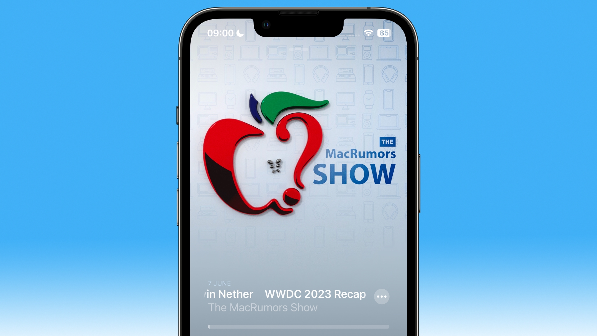
The biggest change is a slick new design for the Now Playing screen, which allows the dominant color of the podcast art – or any episode chapter images – to take over the entire screen, sometimes with additional patterning.
The playback controls on the bottom half of the screen have also been rejigged. The play speed button has been moved from the bottom left corner of the screen and now sits next to the rewind button.
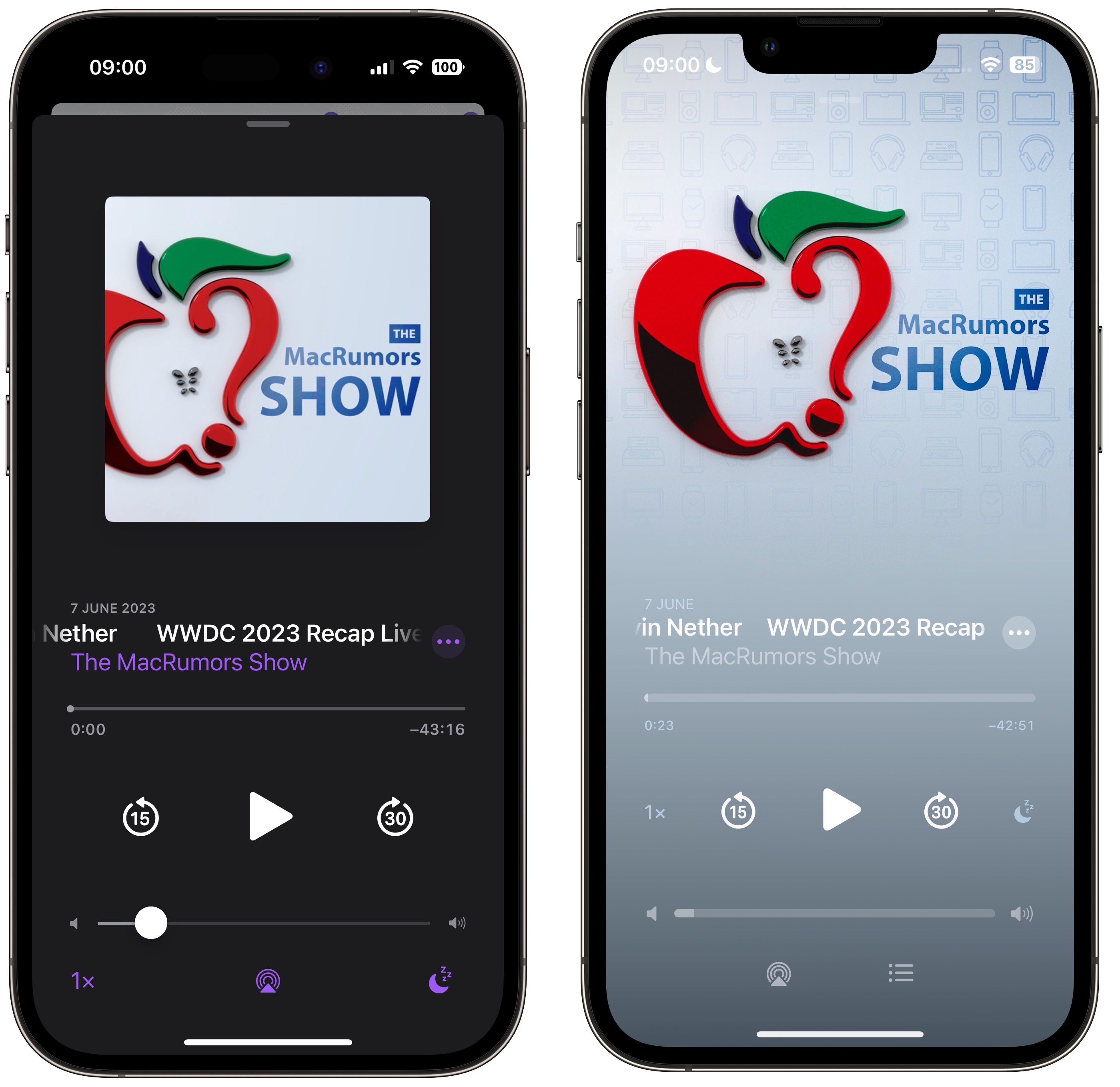
The sleep timer button has also been moved from the bottom right corner and is now located next to the fast-forward button, so the main bank of controls is more compact with five buttons in the row instead of just rewind, play, and fast-forward. Some buttons also now take on a neat new glow when activated.
The queue interface has changed, too. Whereas previously you swiped up to see if anything was in the Playing Next list, now there’s a dedicated queue button at the bottom next to the AirPlay icon.
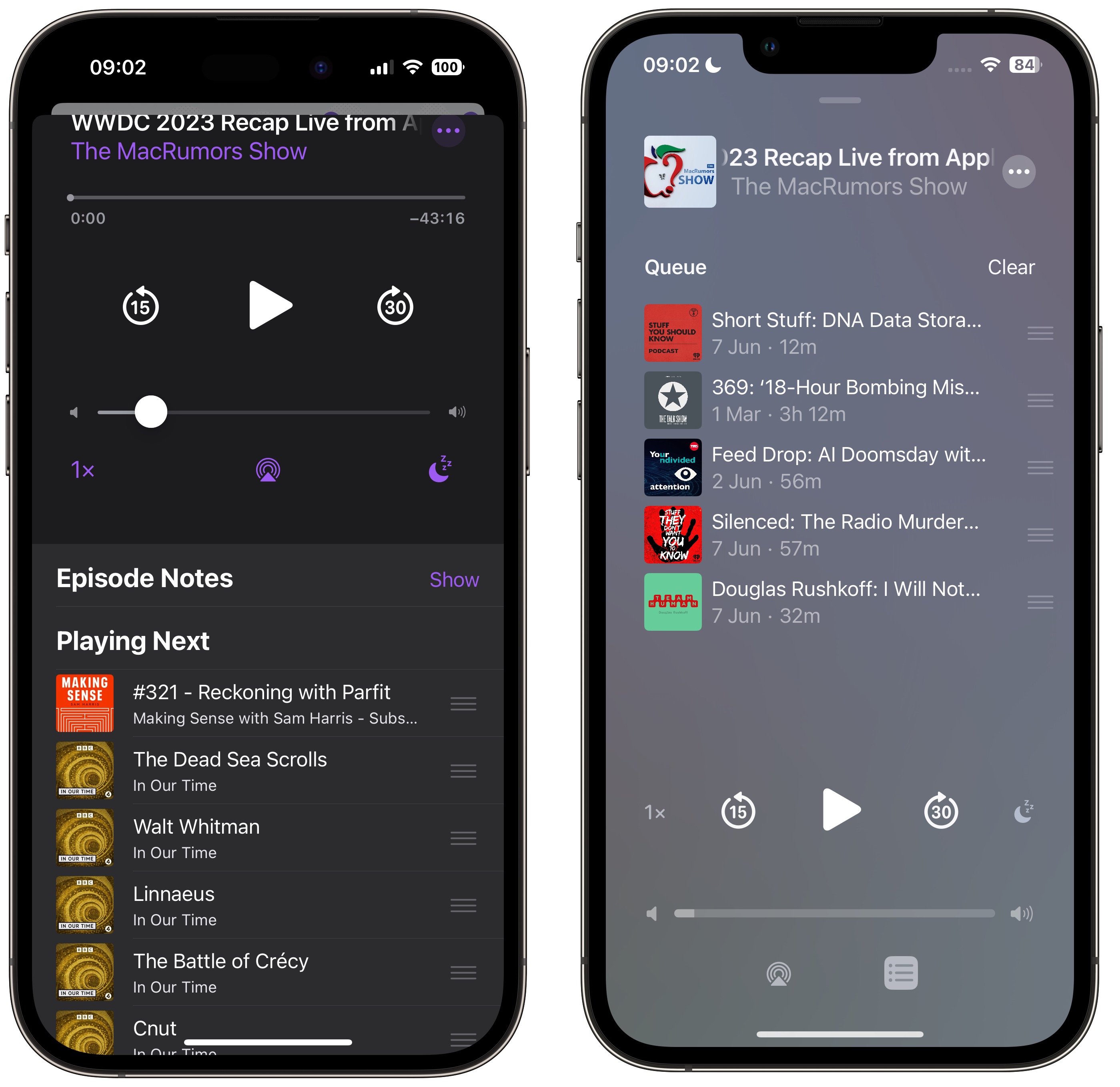
Pressing it brings up a whole new screen showing any queued episodes as a list. You can swipe to remove an episode from the queue or clear the list, and if there are no episodes up next it will tell you that nothing is queued.
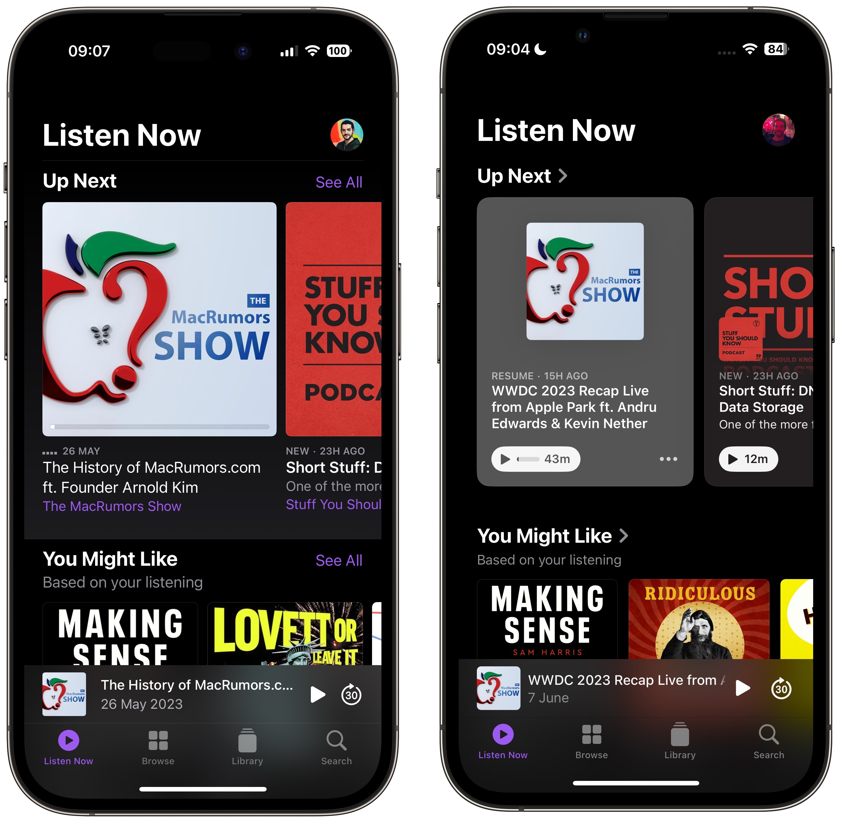
The Up Next carousel at the top of the Listen Now screen features redesigned cards that add a color shade to go with the podcast’s art, and they feature a new three-dot options menu icon, a new compact playback indicator that shows if you have started a podcast but not finished it, as well as the episode’s length.
The same indicator can also be found in the Up Next screen, where the “Play Next” and “Play Last” options have been replaced with “Add to Queue.”
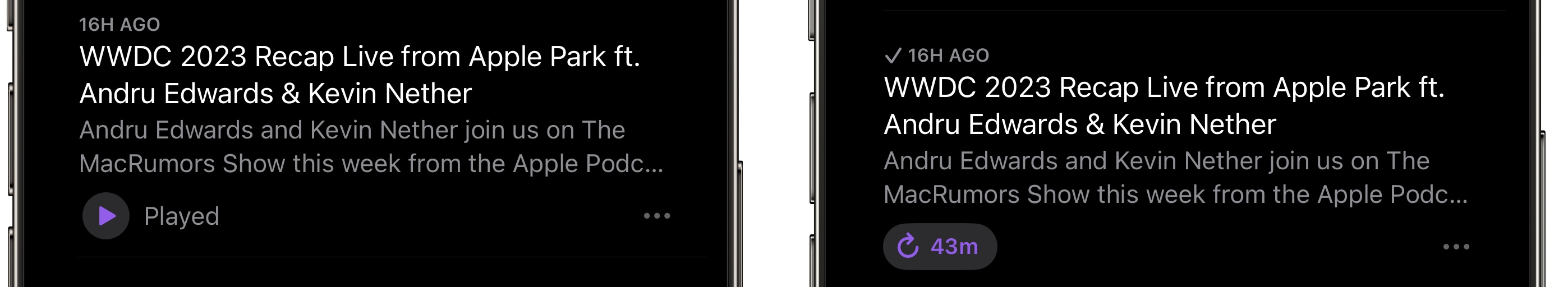
In iOS 16, if you’ve completed an episode in a podcast’s episodes list, it just says Played below the episode summary. In iOS 17, that’s been replaced by a replay icon and the episode length. A checkmark now also sits next to the date above the episode title, indicating that you’ve listened to it.
This article, "Here's What's New in the iOS 17 Podcasts App" first appeared on MacRumors.com
Discuss this article in our forums